I can remember reading and re-reading and re-re-reading issues of Watchmen as they were coming out in the mid-1980s. At the time, I knew it was a big deal – a great comic. I had already been enjoying Alan Moore’s Swamp Thing, and was looking forward to Watchmen even before the first issue came out. Among many things, it is a murder mystery and I remember re-reading issues looking for clues for me to solve the whodunit.
I even remember that I was buying a couple copies of each issue, expecting it to become a collectible. So much for those plans though, as I loaned the first three or four issues to a woman I met in a laundromat. I had a minor crush on her, of course. If I remember correctly, she was reading a sci-fi book and we had a conversation while our laundry spun. I ended up giving her my phone number and loaning her a couple of early Watchmen issues that I had extra copies of… then I never heard from her again.
Anyway, Watchmen is now widely acknowledged as one of the greatest comics ever.
It was created by Alan Moore (script), Dave Gibbons (art and lettering), and John Higgins (colors).
In recent years there is a lot of great (and not so great) Watchmen analysis available on the web. Lately my favorite is the Under the Hood podcast where Hassan Otsmane-Elhaou and Kieran Shiach spend 30-60 minutes going through each page. There are also an excellent Kieron Gillen video, Hassan Otsmane-Elhaou’s Strip Panel Naked videos (including Time Signatures, Power through Composition), and a few issue-by-issue podcasts underway including Watching the Watchmen and Watchmen Club.
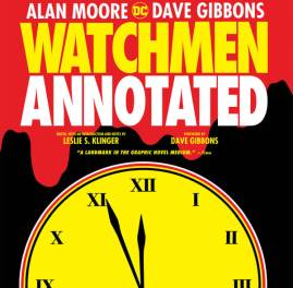
In late 2017, DC Comics published a new edition: Watchmen Annotated. It reprints the full series in black and white, with annotations by Leslie S. Klinger, who had access to Moore’s script via artist Dave Gibbons. DC puts out lots of collected editions of Watchmen, and after picking up the initial trade paperback in the 80s, I’ve resisted picking up any new Watchmen editions, in part because of the ways that DC angered Moore over the Watchmen contract. I am pretty into Alan Moore annotations, though, so this week I bought a copy of Watchmen Annotated.
One of the really fun things about Watchmen is that I have read it a couple dozen times, and each reading I end up seeing new things. There is plenty in Watchmen Annotated that I was already aware of, but here are ten things I hadn’t noticed before:
1 – Blood on Smiley an Apt Symbol For What Watchmen Does: This seems like it should have been obvious to me, but I didn’t make this connection. (Nor had I read that Moore and Gibbons have made this point in interviews.) The smiley face with the drop of blood on it is the opening of the story, typically shown on the cover of nearly all collected editions. The smiley face, in its simplicity, is representative of comics – a medium that visually reduces representation to not-highly-detailed drawings: cartoons. The blood (especially as shown more realistically on the cover of issue 1) represents a sort of serious reality. One of the big things that Watchmen does is to answer the question of what costumed superheroes would do in a more real-world setting. So, the very first image stands in perfectly for one of the overarching themes of the work.
2 – Rorschach’s Voice: There’s a great comics device where Rorschach’s voice balloons have distinct jagged borders, but the jagged borders go away when he takes off his mask (including in chapter 6 when he is prison.)
3 – Grafitti ‘One in Eight Go Mad’: I’d seen plenty of recurring graffiti, but I didn’t notice the recurring phrase “one in eight go mad” which first appears at 1.24.1. According to Klinger’s annotations, the phrase was inspired by graffiti from the London artists group King Mob.
4 – Food Packages at Moloch’s: Now it appears obvious to me, but I never noticed the piles of frozen food that Rorschach has unloaded from Moloch’s fridge. Rorschach has emptied the fridge so he can hide in it, so the food packages appear at 2.20.5. They appear again at 5.3.5. though this time misleading Moloch and the reader.
5 – Many Sets of “Two Riders”: Chapter 10 is titled “Two Riders Were Approaching…” after the Bob Dylan lyric in the song All Along the Watchtower. I always thought that this applied to Night Owl and Rorschach riding at the conclusion of the chapter. There are actually a half-dozen-plus instances in the chapter where two riders appear.
6 – Falling Glass: I never noticed that the glass is already falling from the windows of the Institute for Extraspatial Studies on 11.27.3.
7 – Left Behind Letters Spell Things: There are a couple of clever instances where Moore and Gibbons play with partially covered wording to reveal other words. On the cover of issue 5, the non-obscured letters from “FALLOUT SHELTER” spell “ALL HEL.” Similarly on 12.6.1, the unobscured letters from “INSTITUTE FOR INTERSPATIAL STUDIES” (combining with an extra scrap of paper) spell out “OR ALL DIE.” (This makes me wonder about other words left behind in Moore works – for example the NYC subway wrap cover for Crossed+100 #4. I have been pondering the scratched-out wording there unsuccessfully for a while.)

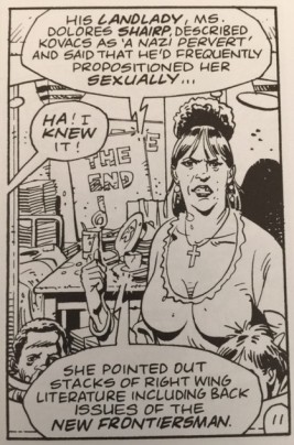
Watchmen #7, Page 11, panel 9 art by Dave Gibbons. In the lower balloon, the word “issues” was relettered
8 – Places Where Gibbons’ Lettering Was Changed: The annotations point out several instances where the wording was slightly changed (apparently mostly to convert Britishisms to Americanisms) and at close inspection, it does appear that the lettering style differs slightly from Gibbons’. One of these is for the word “issues” (changed from “numbers”) on 7.11.9. (We nitpicky annotators have spotted a few of these instances of minor instances of British English in Crossed, Providence, Cinema Purgatorio, etc.)
9 – Kevin O’Neill Art Inspired the Alien Design: This one was pointed out to me my fellow Moore fan, Flavio Pessanha. In the annotations for 8.11.3, Klinger quotes Moore’s script stating that the alien should resemble the progeny of a squid and “a Kevin O’Neill drawing.” Presumably, this might be from O’Neill’s demonic aliens in Nemesis the Warlock, which first appeared in 1980.
10 – Some Rows with Four Panels: This one I actually noticed in looking into the 2017 previews for the latest ill-considered Watchmen spin-off Doomsday Clock, which I haven’t read. Clock manages to copy Watchmen‘s format, without, as far as I can tell, actually replicating much of what is good about Watchmen: narrative experimentation, storytelling complexity, world-building, depth in characters, etc. Anyway, in the early preview posts for Clock, there’s a page (apparently page six) with four panels in a row. I saw this and thought that it had to be mistake made by the Clock creators, because Watchmen is famous for diving up all its pages into nine-panel grids – three rows of three. When I saw the Clock preview, I looked back at Watchmen and, sure enough, the first issue’s title page has a row of four panels (1.6.2-5).
At the time (and now), I chalked it up to the newness of the format still congealing with Moore and Gibbons. But then reading through the annotations, I noticed that there are three (at least?) instances where this unusual format is used. It can be found at 1.6.2-5, 1.13.1-4, and 2.9.1-4. In the annotations for 1.13.1-4, Klinger quotes Gibbons stating (apparently erroneously) that “this is the only time we broke the 3×3 panel grid.”
Watchmen Annotated is one of the few DC Watchmen publications that actually adds to the extraordinarily deep and rich mythos that Moore, Gibbons, and Higgins crafted in the 1980s. I wouldn’t recommend this book as the first thing for a new Moore reader to dive into, but I would highly recommend it for the large fan base who have already read and who already appreciate Watchmen.
Tags: Alan_Moore, annotation, comics, Dave_Gibbons, Leslie_Klinger, Watchmen

Leave a comment