1970s Multi-Panel Pans
Multi-pans (aka Polyptychs aka Super-panels) listed in publication date order.
1970

Three-panel pan from Our Love Story, No. 5, February 1970, My Heart Broke in Hollywood, page 3, art by Jim Steranko
February 1970 – from Marvel Comics’ Our Love Story No. 5, story My Heart Broke in Hollywood, written by Stan Lee, drawn by Jim Steranko (scan from Marvel Visionaries: Steranko trade paperback, 2002.) This is my favorite of the two multi-panel pans from this somewhat offbeat story (the other appears in panels 1-3 on page 2.) Steranko, departing from his stylized superhero art, plays with 1960s fashion and design throughout the story. This three-panel sequence uses circular background items to sort of halo the director’s head and hand in panel one. The circle is echoed in panel three in Wendy Nelson’s hair and glasses.
1971

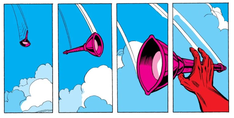
Five-panel pan sequence, from Avengers No. 93, November 1971, art by Neal Adams
November 1971 – From Marvel Comics’ Avengers No. 93 – art by Neal Adams, writing by Roy Thomas. Neal Adams is one of the early very inventive storytellers that expanded comics narrative vocabulary with new angles, new panel configurations, and more.
This is one of Adams’ great visually-inventive stories where Ant-Man is exploring the inside of the android called the Vision. The pacing of the panels here is great – at the top of the column they’re taller. As they descend they become shorter and shorter, with fewer and fewer words. I think it’s interesting that the lettering boxes (presumably added after the artwork) try to stitch these panels together… as if the reader might somehow not notice that the images connect across gutters. Looking through the rest of the issue, nowhere else do the lettering boxes extend beyond the panel borders.
1972

Five-panel pan sequence from Hulk No. 147, second story, page 1, art by Herb Trimpe
January 1972 from Marvel Comics Incredible Hulk, No. 147, written by Roy Thomas, drawn by Herb Trimpe. This is a very good use of a polyptych, to move a character through a landscape. It also paces the narration, breaking it up.
1973
Four panel sequence from Avengers No. 117 – art by Bob Brown – via Attack of the 50 Year Old Comic Books
November 1973 from Marvel Comics Avengers No. 117, written by Steve Englehart, drawn by Bob Brown. The right two panels in this four-panel sequence are a polyptych as the “evil eye” lantern-thing goes across the panel border. It is clear visually what has happened, it looks good, and the panel borders break up the sequence over time. But nonetheless I would term this another example of a motion-logic inconsistent multi-pan. Between panels 1 and 2, and 2 and 3, this is a zoom sequence – indicated by as indicated by the clouds behind rising, and the lantern enlarging. Then the clouds behind it rise between panels 3 and 4, but somehow the evil eye lines up perfectly between panels. Did it somehow do a perfect 180 degree flip? Even then wouldn’t be a bit larger in panel 4? Or maybe the clouds should overlap between the last two panels? Again – it works really well – and my critique is just pedantic nitpickery.

Two-panel pan sequence, from Adventure Comics No. 430, November-December 1973, art by Tony de Zuniga

Two-panel pan sequence, from Adventure Comics No. 430, November-December 1973, art by Tony de Zuniga
December 1973 – Two sequences from DC’s Adventure Comics No. 430 – Black Orchid story The Anger of the Black Orchid – art by Tony de Zuñiga, writing by Sheldon Mayer. Neither of these are particularly visually interesting (nor is the story itself), but they’re early 70s examples – among the earliest DC examples.
1974

Four-panel pan sequence, from Master of Kung Fu No. 18, page 3, June 1974, art by Paul Gulacy

Four-panel pan sequence, from Master of Kung Fu No. 18, page 11, June 1974, art by Paul Gulacy
June 1974 – Two sequences from Marvel Comics Master of Kung Fu No. 18 – art by Paul Gulacy, writing by Steve Englehart. These are the earliest MOKF pan sequences I could find (though I am missing some issues.) They predate Doug Moench’s MOKF days, so, it makes me give more credit to Paul Gulacy for those great early MOKF issues. I especially like the second sequence, where the silence of sneaking on board the airplane is shown in the lack of words. (There’s another multi-panel pan in the issue, on page 2, which is actually the earliest… but I liked these ones better.)

Four-panel pan sequence from Doctor Strange, No.2, page 2, August 1974, art by Frank Brunner
August 1974 – from Marvel Comics’ Doctor Strange, No. 2, written by Steve Englehart, drawn by Frank Brunner. Another early 70s example, not so remarkable, necessarily, but fairly early. I like the shadow of Silver Dagger spread across all four panels… and the way the “thunk” sound effect goes vertical in tall panels… and it’s interesting that it works with just two images of Dr. Strange’s head (just a mannequin, as stated in the fourth panel.)

Four-panel pan sequence, from Detective Comics No. 443, November 1974, art by Walt Simonson
November 1974 – From DC’s Detective Comics No. 443 – art by Walt Simonson, writing by Archie Goodwin. Read my post about the “All New Manhunter,” in this issue teamed up with Batman. This is what I call an overlap cheat, mostly beacause panel 1 shows the assassin twice (so that’s sort of what I call a multi-esposure panel.) The sequence has a somewhat fish-eye lens feel, as the assassin is running in a straight line but goes from facing the viewer (in panel 1) to being entirely in profile (in panel 4.) I think that the colorist made a mistake on panel 4, where the inside of Batman’s cape probably should have been blue instead of yellow.

Two-panel pan sequence from Adventure Comics No. 436, page 3, art by Jim Aparo
November-December 1974 – From DC’s Adventure Comics No. 436 – from the Spectre story The Gasmen and… the Spectre – art by Jim Aparo, writing by Michael Fleisher. No great shakes, but the earliest Jim Aparo example I’ve come across.
1975
January 1975– from Marvel Comics’ Giant Size Defenders No. 3 – written by Steve Gerber, layout art by Jim Starlin, finished by Dan Adkins, Don Newton and Jim Mooney. Two super panel examples that I like (kudos to the always visually appealing Jim Starlin):

Three panel pan from Giant Size Defenders No. 3, page 36, January 1975, art by Jim Starlin
Visually beautiful, if not entirely plausible, motion lines filling panel two.

Six panel polyptych from Giant Size Defenders No. 3, page 43, January 1975, art by Jim Starlin
This one I think is very nice – it sort of stretches out a critical plot moment… the fate of the earth… hangs in the air… for… a… few… tense… seconds… then guest star Daredevil saves the day. Read this blog post for more of my thoughts on the above super-panel.

Four-panel pan sequence from MOKF No. 29, page 18, art by Paul Gulacy
June 1975 – from Marvel Comics Master of Kung Fu No. 29 by Doug Moench and Paul Gulacy. For commentary, see my earlier post.
1976

Four panel pan from MOKF No. 39, page 23, art by Paul Gulacy
April 1976 – From Marvel Comics Master of Kung Fu No. 39, by Doug Moench and Paul Gulacy. For commentary, see my earlier post.

Four-panel sequence from MOKF No. 40, page 23, art by Paul Gulacy
May 1976 – From Marvel Comics’ Master of Kung Fu, No. 40, by Doug Moench and Paul Gulacy. For commentary, see my earlier post.

Five-panel sequence from Action No. 460, page 4, art by Curt Swan
June 1976 – From DC Comics’ Action Comics, No. 460, by Cary Bates and Curt Swan.

Five-panel sequence from Action No. 460, page 5, art by Curt Swan
I tend to think of DC as generally just a bit more old-fashioned than Marvel. That conservatism tends to be a bit more pronounced for DC’s flagship Superman titles (someday I will write about how DC covered up Jack Kirby’s early Jimmy Olsen Superman faces) even compared to Batman ones. For that reason, I was a tad surprised to find these relatively early (before the 80s craze) polyptychs.
I think of Curt Swan as a comic artist very set in the sort of relatively staid storytelling techniques of the pre-1960s. Not that all the art back then was staid, but the sort of common house-style, especially for DC, wasn’t experimental or dynamic.
Swan drew, what, a decade? of… well… boring visually issues of the Legion of Super-Heroes (LSH.)
Swan repeatedly uses multiple exposure panels (ie: a single panel with multiple Supermans shown to describe an arc of action – I showed an MOKF example here – described here) but his multi-pans are relatively rare. His 1970s artwork, especially panel layout choices, are definitely more dynamic than his LSH work… but it seems like both his feet are still very much on the ground. Both of these 1976 Curt Swan examples are ok – they work – but not that different from his more common multi-exposure panels. Both of these could be just fine without the extra gutters. I think maybe Curt Swan was looking around and seeing that the new kids were all doing multi-panels, so he decided to toss a few in. (I am curious to find the earliest Curt Swan polyptych – anyone out there know of ones earlier than 1976?)

Four-panel pan sequence from Iron Fist, No. 6, page 1, art by John Byrne
August 1976 – From Marvel Comics’ Iron Fist, No. 6 – drawn by John Byrne, written by Chris Claremont. I used to really like a whole lot of Byrne/Claremont comics… and many of them are still quite readable. Byrne uses multi-panel pans quite a bit, where they make sense in stories. I like the convergence of the two trajectories in this one – slamming together in the fourth panel. I thought it was unusual to see a multi-panel pan sequence on page one – the “splash page” which generally features one large panel. The single background helps it still read as a full-page panel.

Unpublsihed full-page multi-pan from Swamp Thing No.25 (would have been November 1976) art by Ernie Chan and Fred Carillo
November 1976 (though unpublished) – From DC Comics unpublished Swamp Thing No. 25 – image courtesy Seeds and Leaves, an excellent blog of all things Swamp Thing.
1977

Five-panel polyptych from Action Comics No. 467, back story, page 2, January 1977, art by Curt Swan and Tex Blaisdell
January 1977 – From DC’s Action Comics No. 467, Krypto the Superdog story, written by Bob Rosakis, drawn by Curt Swan and Tex Blaisdell. Typical of the early Curt Swan super panels, it works ok… but there’s not that much going on. It’s just not dynamic. Krypto’s pose is nearly unchanged from panel two through five.

Two-panel pan sequence from Adventure No. 449, Jan-Feb 1977, MFM story, page 1, art by Mike Nasser
January-February 1977 – From DC’s Adventure Comics, No. 449, Manhunter from Mars story “Mission Catch a Killer” – written by Denny O’Neil, art by Mike Nasser and Terry Austin. Nasser’s art is somewhat stylized, including a bit of formal experimentation with panel layouts. The above two-panel sequence is a bit gratuitous… breaking up the dialogue. It seems to me that it work fine without the gutter.

Three-0r-two-panel pan sequence from Adventure No. 449, Jan-Feb 1977, MFM story, page 5, art by Mike Nasser
This second Nasser super-panel I find a bit confusing. Clearly panels one and two form a multi-pan. Panel three doesn’t quite… but has the same size and shape, and nearly the same horizon as the last two panels. Why MM waits a panel to finish his sentence, I don’t know. I include this a sort of hazards of polyptychs warning. I think sometimes artists got enamored with them and tossed them in stylistically, even where they end up looking a little unclear.

Three-panel pan sequence from Super-Team Family, No. 9, March 1977, art by James Sherman and Jack Abel
February-March 1977 – From DC’s Super-Team Family, No. 9, Challengers of the Unknown story “To Doomsday and Beyond!” – written by Steve Skeates, art by James Sherman and Jack Abel. By the late 70s these sequences start to proliferate into otherwise fairly forgettable comics like this one… though the sequence itself reads well. Jack Abel inked some of Gulacy’s MOKF work (see above), so perhaps he brings the multi-pan with him to other work.
1978

Three-panel pan sequence from Batman Spectacular, Summer 1978, page 36, art by Michael Golden
Summer 1978 – From DC Comics Batman Spectacular (DC Special Series Vol 2 Number 15) – Batman story I Now Pronounce You Batman and Wife! – art by Michael Golden, writing by Denny O’Neil. Golden is an artist I used to like a lot (and still do), and he uses pan sequences here and there to fairly good effect – in service to the narrative. I like the sort of motion arc through the three panels – down-up-down-up-down. This one is what I call a cheat – there are five Batmans in three panels – so it’s sort of multiple-exposure meets pan. (The coloring isn’t all that good, though, to my taste – not sure why they didn’t chose actual Batman blue and gray.) In this story he uses three multi-panel pans; others are page 40 panels 6-7, and page 46, panels 3-5.
1979

Four panel multi-pan from DC Comics Presents No. 8, page 12, April 1979, art by Murphy Anderson
April 1979 – from DC’s DC Comics Presents No. 8, written by Steve Englehart, drawn by Murphy Anderson. I like the visually flow of this one. It’s one very clear, very legible arc. The fourth panel is nicely perfectly horizontally framed, with Grundy being whacked out of the left edge of the panel. Read a bit more on the above multi-pan here.

26 January 2015 at 1:21pm |
“I especially like the second sequence, where the silence of sneaking on board the airplane is shown in the lack of words. ”
again, way-above-average, both gulacy’s work and your insight.
26 January 2015 at 1:30pm |
“. Read this blog post for more of my thoughts on the above super-panel.” dude, cut it out, bitch. i got a life.
diclaimer:
i was LOL as i wrote “dude, cut it out, bitch. i got a life” , hope ur 2.
anyway, i just discovered your pages. talk about alice down the rabbit hole! one of these days i’ll take a break from your blogs (not yet & not now). but even so, i’ll b back, haha
btw if i disappear for a while and u didnt get my email, u might (or might not) be interested in http://bellatop.com/the-crossover.htm
http://crossover.bellatop.com/
for any1 into this
26 January 2015 at 1:32pm |
“hope ur 2.” refers to “i was LOL”
now then, im going back to diving into more of your blogs…
wow
15 February 2015 at 3:51am |
Hi Joe,
I also always seem to notice the multi-panel pans (though I didn’t know it had a name). There were a lot in Tom Strong, which I think gave the comic a bit more of a modern feel. There’s a good example in the unpublished Swamp Thing #25 of 1976 (art by Ernie Chan and Fred Carrillo). I can send you a scan. I couldn’t work out how to email you but I can be reached at my website: https://seedsandleaves.wordpress.com/
I found your blog because I, too, am an Alan Moore fan and have just started reading Crossed. I just read the first couple of volumes, which were a bit too much for me, but am enjoying Moore’s take. I have some better scans of the variant covers too. Just get in touch.
Excellent work you’re doing.
Zac.
15 February 2015 at 7:07am |
Very cool to get your comment and read through your site, Zac. Those Moore Swamp Things are what got me hooked on Alan Moore! I’ll email you right away.
16 February 2015 at 10:54am |
It’s a great page! I’ve put it up just now – will add more details and analysis when I get around to it.